Bang!

In a few days here in the UK we will celebrate Guy Fawkes Night (or Bonfire Night); a strange annual custom that originated from a foiled attempt to blow up the Houses of Parliament in 1605 and is currently marked by the lighting of communal bonfires, burning effigies of the hapless conspirator, and the setting off of vast amounts of fireworks. Well, that’s the general concept anyway.

The reality is a little different. While celebrating a failed act of 400 year old terrorism could be seen as a little insensitive in modern times, it is fair to say that most people today don’t really know or care of the origins and see it as an opportunity to get together outside in front of a huge fire in winter, eating, drinking and making merry while setting off ever more spectacular fireworks.

I am not a big fan. As a dog owner, I sympathise with all the animals at this time of year. As a Yorkshireman, I cannot for the life of me justify the expense of the things. As a designer, I am interested in the packaging and had a look at what has been on sale recently. Oh dear.

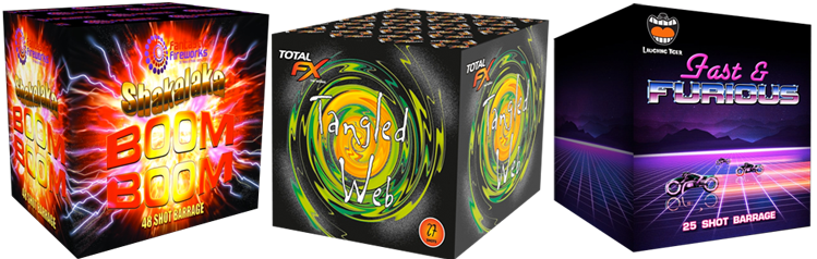
They’re not all like this of course – some are far, far worse, but many of them look like they’ve been churned out by teenage boys full of energy drinks at 3am.

I could continue with a nostalgia piece now and reminisce about when bonfire night was bonfire night, and you could get a bag of ‘Little Buggers’ Bangers and a packet of Spangles for 7½p, and play merry hell down the gennel without all this official ID and over 18 nonsense. But I won’t.

I did start looking around for vintage fireworks packaging on the web though, and found some interesting stuff. Many types of ephemera become collectable over time and it appears that firework graphics are no exception. They were seldom printed in more than 3 colours and were often quite inventive in maximising this constraint.

I was particularly taken by this Catherine Wheel:

Not because it is beautifully designed – although it has a certain charm – but because it does what it needs to do without resorting to the visual vomit of the filter gallery!

And remember, safety first.

A great collection of vintage fireworks can be found here.


Sing Along!

All together now! Who doesn’t love a good sing song! Especially when we’re young! My friend Jon Lawrence (also known as The Music Man!) has just released another collection of original songs for children – with illustrations by yours truly!

Here’s just a little taste of what’s inside…

Published by Eyrie Press, this is the second book by The Music Man, which even comes with a CD with recordings of all the songs so you and your little one can sing along!

You can buy your copy directly from Eyrie Press and all the usual online book retailers, but you can also buy directly from Jon himself, who will even sign your copy – bonus!

The Vinyl Countdown

Some of you may recall a fairly regular feature on my old blog on items from my old vinyl record collection (and my dad’s too). Just as vinyl has made a remarkable return to the fore, I too will be returning to my old stash for the blog.

This has been inspired by my daughter’s recent interest in the format and acquisition of a suitably modern record player with retro styling. I’ve been excited about seeing vinyl albums back in the house – even though are musical tastes are poles apart, I have found much satisfaction looking at her small but growing collection, reading sleeve notes I can actually see without a magnifier!

Just handling records has an emotive pull for me; takes me back to my youth, saving up and heading to the record shop in town to browse through the racks, next to rockers, mods and hippies, all doing the silent shuffle down each column, usually from left to right, trying to time your move to the next column just as the next guy did. It was almost always guys as I remember.

This was in the mid eighties when Top of the Pops and the Sunday night chart rundown was the main place most people heard new music. For some of us, John Peel filled in the gaps, and when I started getting in to punk and indie clubs (I went many times and didn’t get in – bloody puberty!) I really started to hear some interesting and exciting music.

Until then, in the days before instant streaming, I learned about music through artwork. I formed my ideas and opinions on the visual relationship I made with the cover art. I could name you the entire back catalogue of certain bands and describe their individual sleeve design while never having heard any of them.

I was aware of all sorts of music, bands and singers because they were all listed alphabetically, regardless of genre. You had to look through them in order to find something you wanted. You browsed. B-R-O-W-S-E-D! We spent hours in those places, just looking. Absorbing the visuals and slowly piecing together a general, if limited knowledge about music.

I took a few chances too and bought albums purely on the cover art alone. Some were good records too. Others less so. I still loved the covers though.

Its worth noting here that during this time I was studying graphic design at college – I ultimately wanted to design record covers – so I was understandably more turned on the visual elements of music but I know I was not alone.

So it’s back into the garage to dig out a few old favourites. Stay tuned, pop-pickers!

Happy New Year

New years resolutions don’t usually feature in my life, but I have decided to put more effort into blogging after the dismal efforts last year, so I guess this can be classed as a resolution.

I hope you all had a great holiday and that you gave and received a few good pressies too. I did. Oh boy.

I was gifted a wonderful vintage DYMO label maker by my good friend Michelle (who always gives great presents, but this year she outdid herself!) and I want to show it off.

These were also known as ‘Tapewriters’ and I remember having a cheap plastic one in the 1970’s that looked like a Star Trek phaser. This one, however is from 1963 – five years older than me! – and is chrome.


Chrome! And it’s about a foot long too!


It has a purposeful heft and everything operates with a satisfying ‘clunk.’

In itself, I think this is a fantastic present. But it gets better. It came in it’s original packaging – this is new old stock!

It all fits in a nifty stiff leather case complete with carry handle and gold logo print…


And it also has its original shipping packaging too – I have photographed each side and assembled it as a net:


You gotta love those line illustrations!

And if you thought it couldn’t get any better, it had all the original literature with it!


And for the the afficionados of such retro graphics, here is the main leaflet in more detail:

I’ll be clicking away in the corner if anyone wants me.

Thanks Michelle. X


Saturday night at the movies…

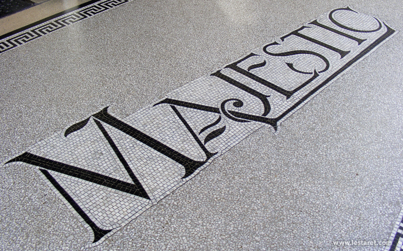
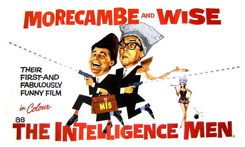
Well, Sunday morning, actually, to catch an early tour around King’s Lynn’s Majestic Cinema, a lovely late 1920’s building with an arched entrance and copper domed clock tower.

Even before you get in the door you are confronted by lovely mosaic tiles – when I’ve mentioned this to people I have found that many regular cinema goers were completely unaware of this! There are also some delicate stained glass panels above the doors too. You don’t get entrances like this at your newfangled multiplex cinema experience, do you?

After a tour of the projection rooms, sadly not worth recording here*, we headed for the tower (the bit I was most interested in because I had been informed that there were original movie posters pasted on the walls. First was an old classic that probably wouldn’t stand up to modern scrutiny…

Another classic that had been elegantly enhanced by an electrician at some point.

I bet you were thinking “Zibber zibber zum” weren’t you?

After the fiddler comes the King! I love the headline – HIS NEWEST – HIS BIGGEST! Ironically though, not his best!

A little composite was at the top of the stairs…

I love the moustache – we don’t seem to do this anymore…

The Robert Redford graphic appears to have been cut from a Great Waldo Pepper poster which appear to be fetching decent money these days. D’oh!

And my favourite here was the overlayed, peeling poster for The Magnificent Seven:

A little research revealed that the poster below was The Intelligence Men by Morecambe and Wise – I was hoping it was going to be The Magnificent Two, but that was a wish too far!

Anyway, if you’re interested in the art of movie posters there are a couple of documentaries worth looking out for:
24×36: A Film About Movie Posters and Drew: The Man Behind The Poster.

*Alas, the the cinema has no team of sweaty projectionists changing vast spools of 35mm film – it’s all digital these days. Plug and play. No romance. A sign of the times…

Exhibition Preparation

With the ‘Flatlands’ exhibition opening on Saturday, its been all hands to the pumps, planning, prepping and hanging at Greyfiars Artspace this week, with a little more to do tomorrow. The vinyl lettering for the window was installed yesterday and looking good against the reflection of the Greyfriars Tower.

There has been much measuring, levelling, considering and squinting through half closed eyes going on in order to get everything just right, all accompanied by Nick’s amazing silent whistling – honestly!

Getting everything measured out, level and marked up really brought out my OCD!

While elsewhere, things were a little less organised!

And finally, in a blast from the past, I actually put some old Letraset to use! Ah the memories…

Our opening event is tomorrow between 4 and 6pm – pop along if you can make it!

Raise your glasses

I’ve been releasing teaser images of this project in progress on Twitter and Instagram as well as here and have received a fair bit of interest so far, so I am delighted to reveal the complete project.

One of the main design elements of the design is the typography, loosely based on English uncial scripts of found on manuscripts and religious documents. I got a little carried away and developed a whole range of ligatures that I didn’t really need, but I was enjoying myself!

There are four brews, porter, pale ale, ruby ale and wheat beer, each named after an order of monks established in the town during the 12th and 13th centuries. Although the monasteries are long gone, the remains of a number of their buildings can be found in those districts of the town that have continue to use their names.

The solemn monk (who I have named Brother Gregory) will be printed in a gloss spot varnish on a matt surface, as will the South Gates logo on the neck label to suggest a ghostly apparition…

There are colour matched bottle caps for each brew, each with a different graphic element – the South Gates typography, the building, Brother Gregory and a symbol derived from a Dominican star symbol. And for those of you who are interested in the details, click on the image below to look a little closer.

I can’t wait to taste them now! Bottoms up!

The world is all gates*

I’ve been working on another craft beer project recently, and am able to share a few images of work in progress with you…

The South Gates in King’s Lynn stands over the main route into the town (to the delight and frustration of visitors and motorists!) and dates way back to the 14th century. The building is actually one of the oldest brick built structures in the country – the stone facade was added a century later. King’s Lynn has many historic buildings, most of which feature upon local publicity, but the South Gates is much less used than the others, so what better symbol to represent the home town of a new enterprise – the South Gates Brewery.

Each of their beers is named after the orders of monks that were based here and still lend their names to different areas of the town, even though the friaries are long dissolved…

The full labels are almost complete so I will be able to share them next week! Cheers…

*The world is all gates, all opportunities, strings of tension waiting to be struck.”
Ralph Waldo Emerson